Don't Be Afraid of the Dark
Part one - What exactly is 'dark mode' and where did it come from?
Whether you're an avid 'dark mode' fan like I am or have never intentionally used it before, there is a good chance that you have at least heard of it. In this series we'll be taking a deep dive into where it originated from, the pros and cons of using it and how it can be implemented.
Dark what?
'Dark mode', also called black mode, dark theme or night mode, is a colour scheme that uses light-coloured text, icons, and elements on a dark background and is becoming increasingly popular on both the web and modern technology in general. Android officially rolled out system-wide support for dark mode on Android 10 in 2019 and on Apple devices with iOS 13 in 2019 however dark mode isn't a new concept. Let's take a trip back in time to the beginning of home computing... travel with me!
A brief history in black and white
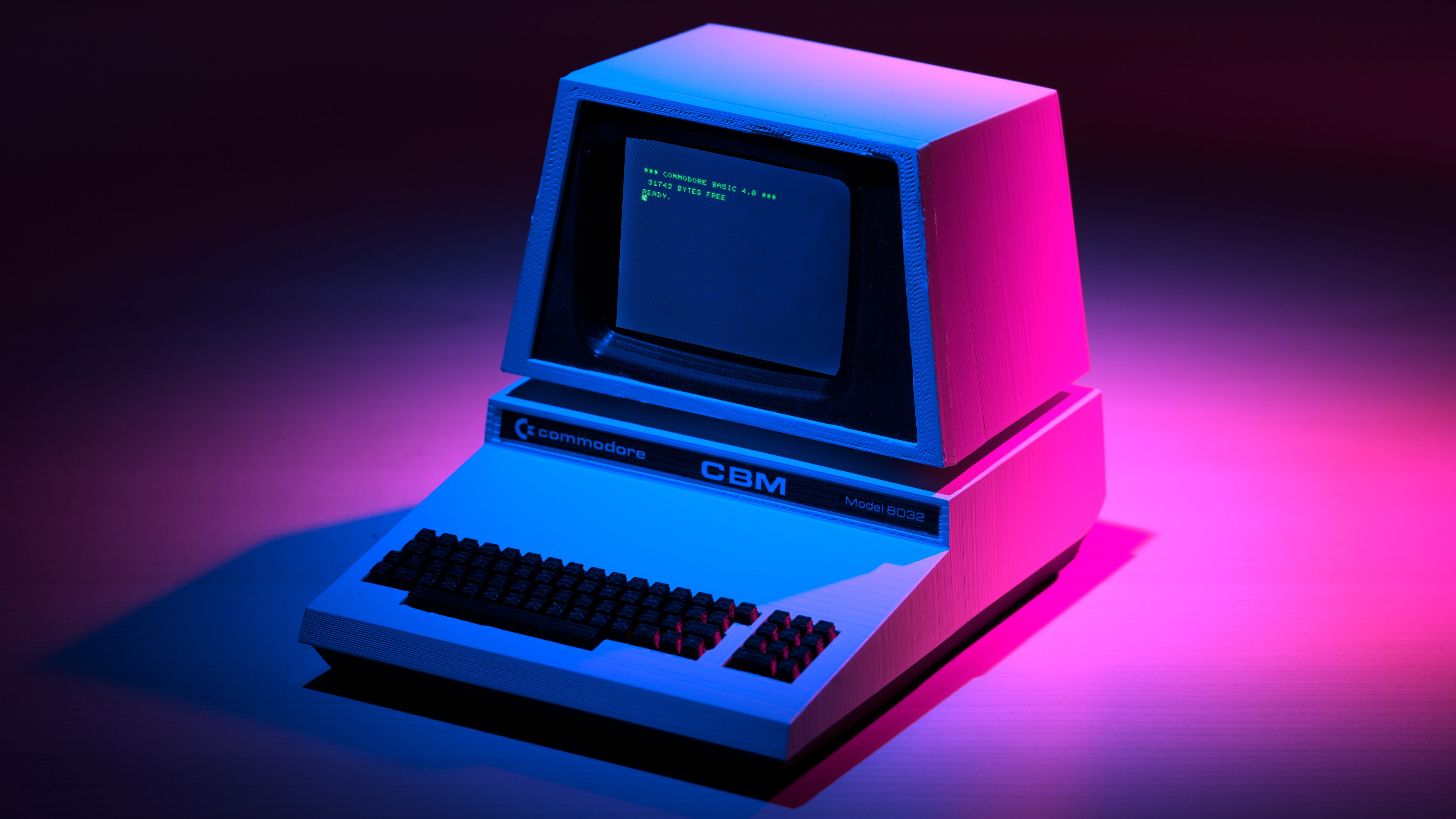
The year is 1981 and you've written a cheque for £875 or $1,565 (which is the equivalent to a whopping £2,596 or $4,481 in today's money) and bought yourself an IBM PC 5150, arguably the most popular and influential home computer of all time. This high spec monster came with 64kB RAM, 320K storage and, for the relevance of this article, a monochrome or colour display. This display was... wait for it... white/green text on a black background. The reason, simply put, is that displays work by turning parts of the screen off to display black and on to display colour. Personal computers back then weren't efficient enough to illuminate parts of their CRT screens without burning out and so black was the default. It wasn't until the Macintosh II release in 1987 where colour in external monitors was commercially supported and the idea of having black text on a white background became more of a reality in the home.
Fast forward a few years into the 1990s and the early web was a very different place. It was by and large, as far as the average user was concerned, a growing directory of static websites made by hobbyists, enthusiasts and scholars. The growth (and burst) of the .com bubble saw companies grow their online presence and the teams behind these websites had much less experience and knowledge than they do today. Today web development teams compile masses of research of colour theory and design psychology and principals backed up by analytics that monitors the effect of every interface change to create a great user experience. Back then this data wasn't as readily available. The difference is very... noticeable. To demonstrate, take a look at the first ever snapshot of amazon.com and apple.com. Regardless of the laughable design efforts, white pages with black texts were now the norm.
Evolution
noun . /ˌɛvəˈluːʃən/
a gradual process of change and development
The early 2000s saw the transformation of the web which shaped it into what we see today. It saw the evolution and development of Web 2.0; the Internet era defined by the boom of social media sites, blogs, wikis and video sharing. Continuing on the white background with black text theme, these popular websites all began to follow these similar design principals. However, something started to happen in the 2010s.
Where once dark mode was necessary due to the technical limitations of CRT displays, it was now being rolled out for accessibility, power consumption and personal preference reasons in the 2010s. Inverting the colours to display lighter content on a darker background meant that it could be more enjoyable to use in lower lit rooms or at nighttime, it would save power and would also keep happy the users who generally prefer darker colour schemes (I'm looking at you, programmers).
Going full circle back to the top of this article, the year is 2019 and the two major mobile operating systems iOS and Android have rolled out system-wide support for dark mode, giving steer to designers everywhere to create compatible colour schemes in a bid to keep their users as happy as possible. The Internet's most popular websites and apps like Facebook, Twitter, Instagram, Github all now give you the option to switch off the lights and enjoy an alternative dark colour scheme.
Now that we're all caught up on what dark mode is, let's talk about why it's good.
You can play around with this by clicking on the 'moon' icon in the top left of this page to goggle dark mode on and off. It's not for everybody understandably, but having the option can be great for your user retention.
Why you shouldn't be afraid of the dark
Using dark mode is a preference that doesn't suit everybody, but there are a few advantages to flipping the switch and viewing the online world in the dark.
It's better for the environment!
Modern apps are ever-increasingly consuming more and more of your phone's resources and a way to help your phones battery life is to use dark mode. I mentioned in the previous section that lighter screens use more power due to the need to turn a pixel 'on' to show white and by contrast turning it 'off' to display black. You may be shocked to find out that using dark mode can increase battery life on OLEDs by 30%!
Less strain on the eyes
There is recent conflicting evidence of the benefits of dark mode with regards to sleep but one thing is for certain; it's easier on the eyes. I know from personal experience that I actively avoid apps and websites late at night that don't have dark mode. The dimmer the screen, the less my eyes have to squint.
In addition to this, I'm a software engineer by trade and in the industry dark mode has an almost cult-like following by this point. A huge majority of the tools that we use have dark mode as an 'opt-out' option with the default install showing a dark interface. Perhaps this stems from the 'hacker' stereotype of hammering away into a black terminal with green text, but after hours of staring intensely at code, your eyes do start to thank you.
The downside
Accessibility with eye conditions
Dark mode has very few disadvantages but a major downside is if you suffer from visual conditions such as astigmatisms. If you get your eyesight checked regularly then the chances are your optician has informed you if you have astigmatism. This is nothing to worry about and in fact around 30% of the population have one, but basically, it means that one or both of your eyes have an irregular shape which causes blurred vision making focussing harder. A particular challenge to focus on is... you guessed it... white text on a dark background. If you do struggle with dark mode but are unsure why this may be the case. It is far from a litmus test but it could be worth consulting your optician.
How to enable it
Dark mode is very easy to enable and also revert to 'light mode' in case you don't like it. The way you enable it is fairly predictable but I'll describe how for both major types of mobile and desktop operating systems.
Mobile
Note that the following guides are for the latest versions of the operating systems (at the time of writing) so they may differ slightly depending on the version and flavour that you have installed.
Android
- Tap the settings icon
- Select 'Display'
- You'll see a toggle for Dark Theme: Select to activate it
iOS
- Go to Settings
- Select 'Display and Brightness'
- Select 'Dark' to turn on Dark Mode
Desktop
Much like mobile, the following might differ slightly depending on the version and flavour that you have installed.
Windows
- Navigate to Settings > Personalization > Colours
- Open the drop-down menu for 'Choose your colour'
- Select 'Dark'
macOS
- Choose System Preferences on the menu bar
- Select General
- In the 'Appearance' section at the top of the window, click the 'Dark' option
Final thoughts
Dark mode isn't for everybody. In fact, despite that this blog post is obviously in favour of using it and my bias shines through quite noticeably, I fought using it for years. I would get berated by my peers for using light themes in my text editors and questioned aggressively (although playfully) as to why I was not using a dark theme. The truth was that I preferred a lighter colour scheme! And honestly, that's OK if you do. The point of this blog post wasn't to convert you; you like what you like at the end of the day. However, having spent a little time trying out dark mode I noticed myself getting fewer headaches after staring at the screen for longer periods. Not only this, but longer battery life in an age where every app is hungrier than the last is a huge benefit for me.
My advice would be to try using it for a day or two if you don't already and see what you think. You might just like living in a darker web.
This is part one of two in this Dark Mode series. Part two will focus on how to implement it yourself on your website and will dive more into the technical details.
