

Designing When You're Not a Designer
How I redesigned my website and blog with no design experience
I have been making websites in my spare time since I was about 12 years old. Microsoft FontPage held my hand as I fumbled my way through webpages build exclusively HTML frames, then with Macromedia Dreamweaver as I dragged components into design view like I was building a lego website, and finally Notepad++ and IDEs like WebStorm and VS Code as I evolved into my final form.
I never once had a vision of what I was building.
I knew vaguely what I wanted to achieve and what I needed to allow the user to do, but no thought at all was given to how it would look as I threw the components across the screen and picked randomly from an RBG colour wheel. To give you an idea, my favourite colour combination was blue and orange. Yikes. Don't get me wrong, I knew it didn't look good, I wasn't delusional, I just knew that I wasn't good at designing and making things look good and because of that, I would get frustrated at trying so I just lost interest.
Bootstrap to the rescue?
In 2016, feeling inspired after talking to a bunch of start-ups at a tech fair, I cracked open my laptop and began cobbling together a portfolio website to showcase my experience, projects and hobbies!
It had been a few years since I had done web design by this point as I'd spent the last 4 years in university getting my degree in Computer Science so I didn't really know where to begin. I downloaded this thing I had heard people talk about called 'Bootstrap' and began to play around with it. Within a few weeks, I had my website created and published! Due to Bootstrap coming with somewhat of a default colour scheme and component styling, I had been given the illusion that the design looked brilliant. Oh dear. The Wayback machine has been kind enough to archive this...
My 'proud' design. Good grief.
It had slowly come to my attention that it looked like 'my first website' and didn't exactly give off the professional impression that I had hoped for. I'd say it took the best part of a year for me to get sick of the design, and another year to get around to redesigning it again.
Back to pen and paper
I had spent a few years by this point as a professional Software Developer creating Big Data services; Far away from anything remotely resembling requiring a good user experience but I had dabbled in full-stack activities enough to be dangerous. I was nervous about redoing my website. I thought I'd try something new though, an approach I'd never tried and downloaded the design tool 'Sketch' that I had heard a lot about and moved things around until I liked the look of it. It reminded me of whiteboarding application and system architecture so I didn't feel too out of my depth.
Up until this point, the barrier for me before this was that I spent so long getting CSS right that I couldn't be arsed to redo it if it didn't look amazing. 'Good enough' and 'visible' became pretty synonymous. Well after a few days of dragging my mouse around, for the first time ever, I felt sort of proud. It wasn't amazing, but it looked a lot nicer than the colouring book website above.
Design 2.0. Not too bad, comparatively speaking.
The take-aways
For the first time in my journey as a web developer, I had some learnings.
- Just like when you design software, you need to think about what components you're going need and where it makes sense to put them
- The page should flow like data should flow through a system (easily)
- Taking time to think about the design will save errors and bad impulsive decisions that are hard and time consuming to redo
Let's try that again
I was happy with my first ever design that I put effort into. I liked it a lot! But something happened since then; I became a professional front-end developer. This was somewhat of an accident as I was working for a digital agency that put me on whatever client project that was going, but I actually enjoyed it.
I had been exposed to the benefits of following good designs due to the client's in-house UI/UX team and noticed how nice it was to not have to think about design considerations whilst coding. I had also gotten sick once again of my design and decided to go back to the drawing board. After all, if I was a professional front-end developer I needed something that looked better than my design that still looked like cobbled-together Bootstrap with no consistent colour scheme.
A key reflection from my previous design was that I just did what I thought looked good and didn't follow any guidelines or 'rules'. This was a huge contributing factor to disliking my previous attempts as I quickly realised that everything I did wasn't exactly trendy or fit the current 'zeitgeist'.
This time though I was going to try a more structured approach. I was going to at the very least do some research.
The approach
I spent a good while looking at a lot of different personal websites, identifying trends that I should probably follow, picking out my favourite aspects from them and looking at creative ways to display my information. Fortunately, the content had already been taken care of so I could just concentrate on conceptualising where it would go and how it might look.
Once I had an idea of what would work and look good, I started to design individual components to be styled and moved around on a canvas.
For this, I thought I'd try using a different tool. I had used Sketch for my previous design and it was OK, but during this time my free trial had run out and I'm a very cheap bastard. Well, to be fair, the license was £100 and I was fairly confident that I wasn't going to get my money's worth after this project so I sought out an alternative. I found Figma. As a side note, I prefer Figma to Sketch. It had very similar functionality but I found it easier to use and more importantly it was free. Goodbye, Sketch.
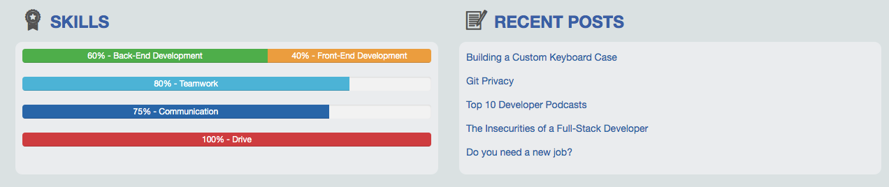
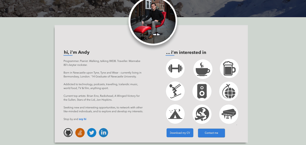
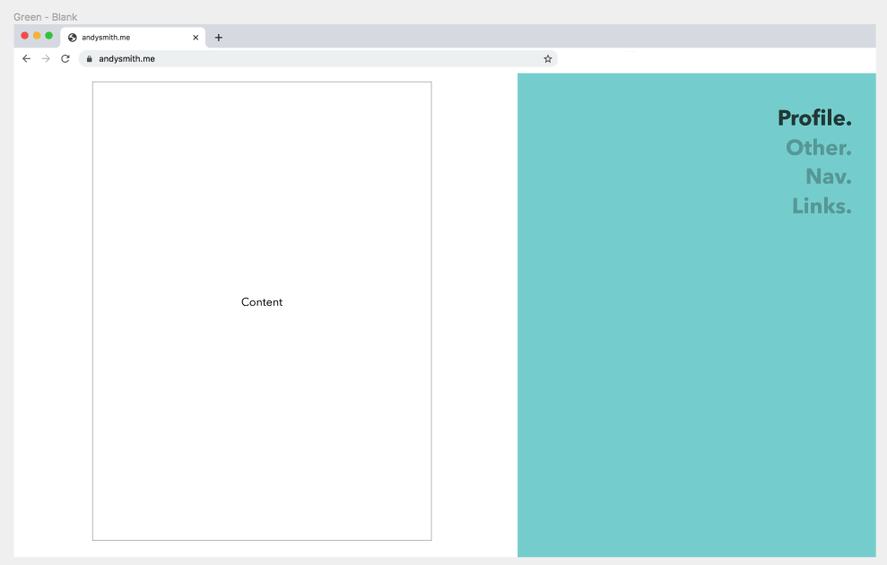
The first thing that I wanted to get right was the general layout and colour scheme. From there I thought that the rest of the design would flow more easily. I wish I could say that I put more thought into this part than I actually did, but all I did was grabbed an RGB colour wheel and clicked until I found a base colour that I liked. The result was the minty green that you see below which I thought stood out and looked pretty good.
One of the things that I realised that I'd gotten wrong before this was using too many different colours leaving the feeling of a lack of 'theme'. For this, I wanted to keep it very simple and so this green (along with various shades of grey) became the theme and 'highlight' colour that I'd use to accentuate important content and hyperlinks. This was a tip that I picked up from Gio, one of my talented designer friends at work.
A major design element that I wanted to achieve was minimalism. I didn't want the pages to feel over-crowded and I thought this would also be easier to get right.
Narrator: "It was not".
For minimalism to feel 'right', I realised that the main content had to be presented in such a way that it captivated the reader without leaving them feeling bored with the overall lack of frills. I played around with a lot of designs (more than that are shown below in the screenshot). I spent a lot of time rearranging components, asking my parents what they thought as I was staying with them at the time over Christmas break and photoshopping and super-imposing roughly 8 different versions of myself onto the designs to see which looked the best. My mum approved of exactly none of them. My sister ended up taking a photo of me on Christmas day specially for this website which is the one you see below! It was narcissistic but at least my mum was happy...
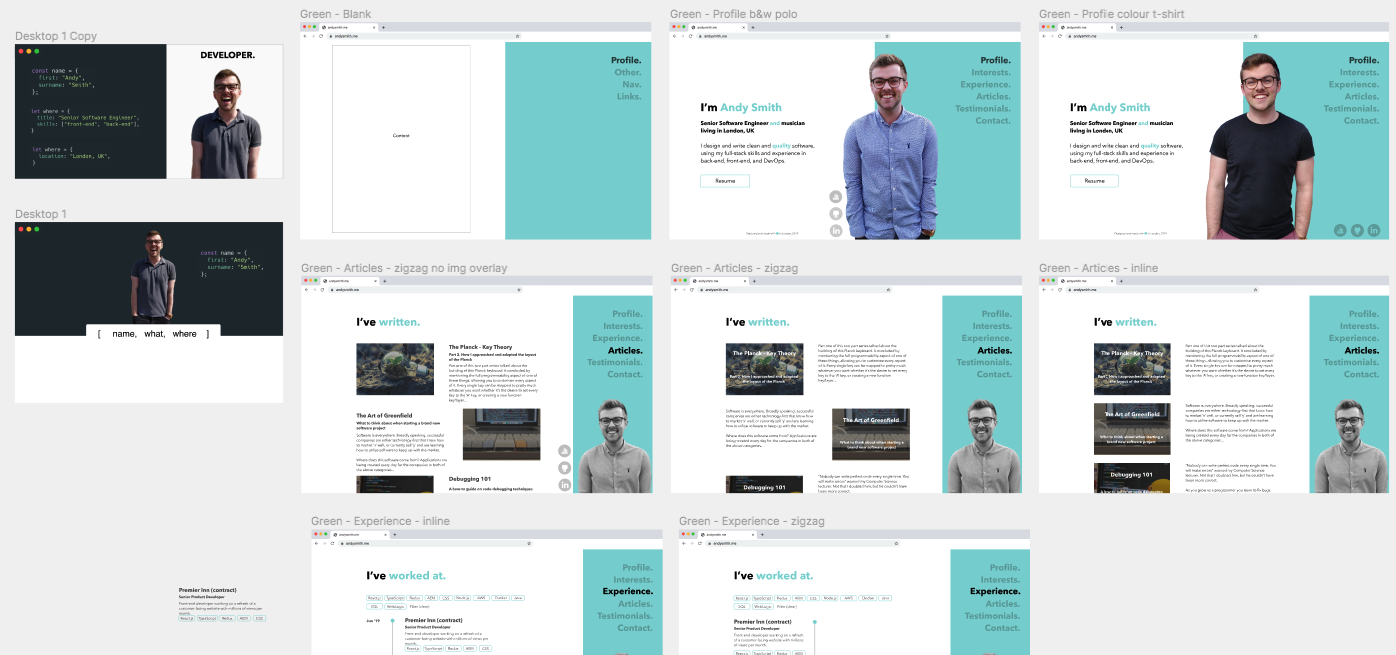
As I said, I ended up with a lot of variations on the designs; more than you can see above. I ended up deleting a lot of the earlier iterations, especially the ones that look very IDE-esque.
The take-aways.
The takeaways from my previous design were still very relevant and held true. The page did still need to flow well and planning ahead and splitting out the designing as a separate task would improve the quality. However, I had learned a lot more doing this better-thought-out approach:
- Using colour carefully and sparingly can enhance the design and help create more of a 'branded feel'
- Minimalism is hard, but it makes you think more about how it should look and it gives you a lot of space to be creative
- Multiple designs take more time but it leaves you feeling more satisfied that you explored more options and didn't just settle on the first thing you made that looked half-ok
- Producing a design that has inherently re-usable components speeds up the coding process ten-fold
Struggles and considerations for next time
Mobile-first is an approach that I knew was favoured by many. However, I was aware from my Google Analytics that only 14.8% of my users were on mobile, and an even fewer 0.8% were on tablet leaving the majority 84.4% on desktop! This contributed to my decision to design for desktop from the beginning.
My error though was that I didn't produce any designs for mobile. What this meant was that when I went to code up my designs there were no considerations for how my components would flex for these designs which meant I had to re-do a lot of CSS.
Not to self: if you're going to prioritise something, don't completely forget about the other stuff. What I should have done was made sure that it also worked for mobile as I went which would have made for fewer mistakes and lost time re-implementing components.
Final thoughts
I don't believe that I'll ever be a designer, but understanding your user and their needs is an important skill to have, and user experience plays a big part in delivering even the functionality as a programmer.
I put a lot of effort into the final design of my personal website as well as this blog. A lot. Design and visual creativity is not something that comes naturally to me. I spent time asking my professional designer friends their opinions, learning from them (a big thanks to Gio), asking my non-technical mum and dad and agonising over pixels and ridiculous things. I spent a lot more time designing than coding but I did that as a one-off to create something that will last, not something that I'd want to replace every year like it's predecessors.
Take your time in designing. Create mood boards. Create a collection of similar sites that inspire you. Create side-by-side designs. Ask the opinions of your friends, technical or no. In fact, I found that non-technical people had the most interesting and useful feedback. Don't be afraid to go for it and fail; your designs will get better over time. You may never replace Jony Ive, but with time and patience, you can create something that you're proud of.


